The starting point
Context
Buenos Aires offers a wide range of outdoor events and activities, but the information needed to plan an outing is not available in one place. Events are shared across social media, fan pages, official websites, ticketing platforms, and informal recommendations.
Before deciding, people must consult multiple sources to confirm dates, location, access, tickets, transportation, and event details.
The information was everywhere
Problem
Finding an event was only the first step. Information often arrived late, was incomplete, or was scattered across different channels, making it harder to compare options and plan an outing with confidence.
Key pain points

Fragmented discovery
Events were discovered through Instagram, specialized accounts, official websites, and informal recommendations.

Incomplete information
Schedules, locations, access details, tickets, and other important information did not always appear together.

Uncertain planning
The lack of filters, maps, reviews, and planning tools made it difficult to evaluate options and decide.
Centralizing information to make better decisions
Opportunity
The opportunity was to turn a fragmented search into a clear, reliable, and easy-to-plan experience, with a particular focus on events in Buenos Aires.

Centralize information
Bring together in one place the information currently scattered across different platforms.

Make discovery easier
Add filters by category, date, and location to find relevant options quickly.

Support planning
Include practical information, maps, access details, reviews, and tools for saving and organizing events.
Every plan in one place
The solution
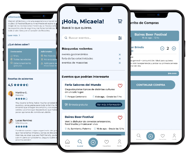
Wanderly is an app designed to centralize information about outdoor events and festivals in Buenos Aires.
The concept brings together events, practical information, and planning tools within a single experience, guiding people from discovering an activity to getting tickets.
The process behind Wanderly
Research process
The research combined analysis of existing platforms, news articles, search trends, qualitative interviews, and content organization exercises.
 5
5
 3
3
 15
15
Key findings
Research revealed that many people discover events through Instagram, specialized accounts, or informal recommendations, but information often arrives late, is incomplete, or is scattered. To decide with greater confidence, they need quick access to key details such as location, access, tickets, transportation, and food options. They also value tools such as filters, maps, reminders, and reviews, which help them find activities relevant to their interests and organize their outings more effectively.
Finding opportunities in existing solutions
Benchmark
We analyzed Eventbrite, AllEvents, Buenos Aires Cultura, Meetup, and Baires Secreta to compare their search systems, content organization, and ticket purchase processes.
This review revealed an opportunity to develop an experience combining reliable information, simple navigation, and a more local perspective on events in Buenos Aires. The product needed to centralize currently scattered information, offer filters by category, date, and location, include reviews from other attendees, provide easy access to maps, transportation, and access details, and allow people to save events and receive reminders.


Understanding people looking for something to do
Interviews
We conducted three qualitative interviews to understand how people discover activities, what information they need, and their main frustrations.
The research revealed different ways of engaging with events. Some people look for spontaneous plans, while others need to plan ahead or find options tied to specific interests. Despite these differences, everyone shared the need to access reliable information, understand practical details, and find relevant events without searching across multiple platforms.
The interviews also highlighted the importance of reviews, maps, filters, notifications, and the ability to save activities.
Card sorting
To validate the content organization, we conducted a card sorting exercise with 15 participants. The results showed a clear association around three main groups: personal accounts, event discovery, and event management. Help and contact were interpreted as a separate support section.
We also found confusion between similar terms such as “Date” and “Date and time,” and between personal information and event details. These findings helped us refine categories, clarify labels, and build a more intuitive architecture.
Task flow
With the architecture defined, we developed flows for four main actions: saving an event as a favorite, buying a ticket, creating and publishing an activity, and applying filters during search.
This exercise helped organize the required steps, identify potential interruptions, and reduce unnecessary actions before moving the experience into the first wireframes.
Building a clear and consistent interface
Design system
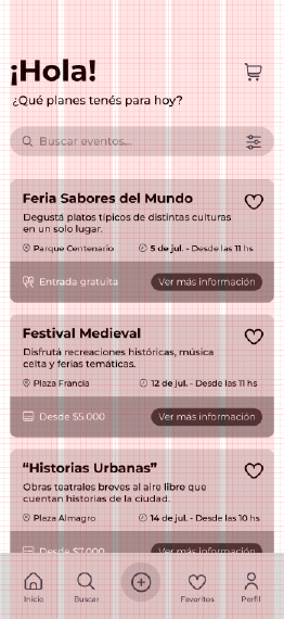
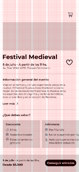
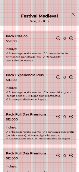
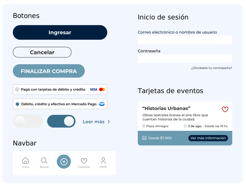
The app uses a five-column layout and an 8 px base grid. The five columns correspond to the navigation bar’s main actions: Home, Search, Create, Favorites, and Profile.
Construction
of the symbol
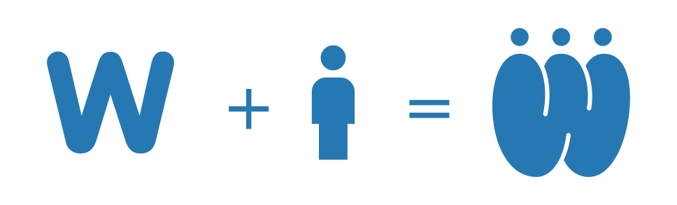
The name Wanderly comes from wander, a word associated with roaming, exploring, and letting discovery guide the way. This idea connects with the app’s purpose: helping people find new plans, explore the city, and take part in shared experiences.
The symbol begins with the letter W and adds three circles that function as heads. Together, the shape can be read as three people gathered together and represents the connection created around outdoor events.
Typography
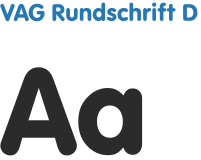
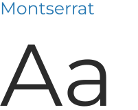
The logo uses VAG Rundschrift D, a typeface with rounded shapes that reinforces the brand’s friendly, approachable character. For the interface, Montserrat was selected in different styles to build a clear and consistent hierarchy.
Color palette
Dark blue serves as the primary color and conveys stability and trust. The lighter blue is used for actions, highlights, and navigation, while light brown is reserved for details that add warmth and approachability.
#001F3F RGB 0 31 63 CMYK 100 86 46 53
#2678B2 RGB 38 120 178 CMYK 83 45 9 0
#EAD8B1 RGB 234 216 177 CMYK 10 14 35 0
#F5F5F5 RGB 245 245 245 CMYK 5 4 4 0
UI components
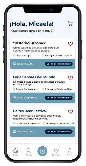
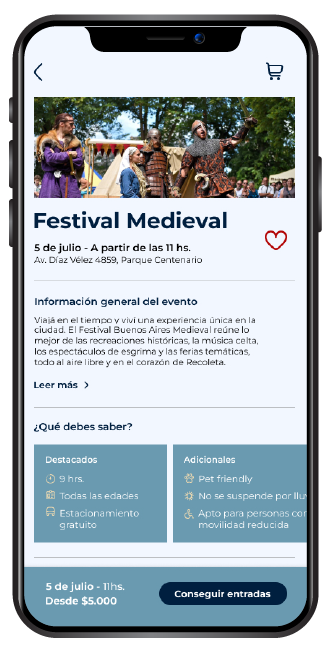
Final prototype
Learnings
Wanderly covered a complete process: researching a need, defining an information architecture, designing user flows, and turning them into a coherent interface with a distinct identity.
The project established the foundations for an experience focused on making event discovery and planning easier.