A doughnut factory unlike any other
What is
DONIUS?
DONIUS is a fictional brand that makes and distributes doughnuts in different shapes. In a category dominated by the classic ring doughnut, the concept was built around a simple idea: make the product more playful, surprising, and recognizable.
The brand world was created for a young audience, mainly children and teenagers, and combines a friendly personality with a fresh, approachable, and colorful language. Shape is not merely a product attribute: it becomes the brand’s main differentiator.
An identity born from shape
Concept
for the brand
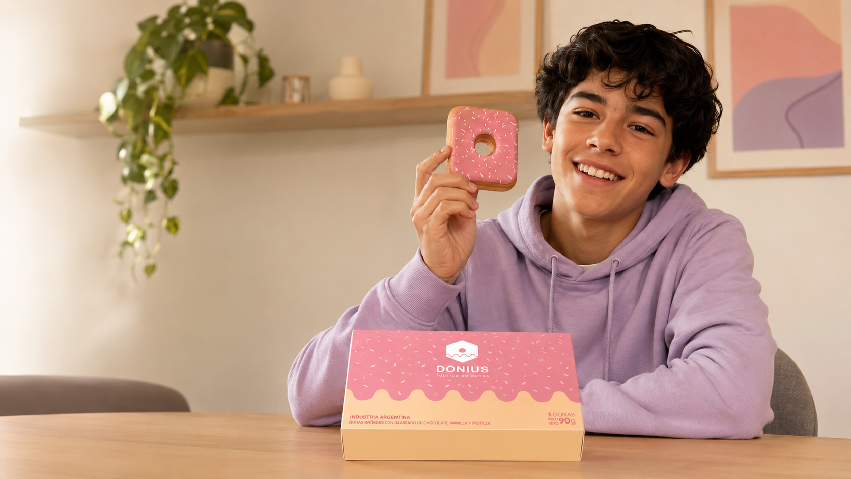
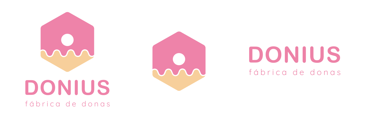
The parent brand symbol begins with a polygonal doughnut covered in pink icing. This decision translates the promise of DONIUS into a simple graphic device: each doughnut can take on an unexpected shape, while still belonging to the same world.
The identity combines soft shapes, pastel and contrasting colors, and rounded typography. The system includes responsive versions, reduced applications, monochrome treatments, and different color combinations to preserve legibility across every format.
One parent brand, two worlds
Sub-brands
To expand the offering without losing recognition, DONIUS is organized as a parent brand with two sub-brands. Both retain the combined mark structure, the icing concept, and the typographic language, while changing shape and color to express a distinct world.
DONIUS · doughnuts + fruit
Concept
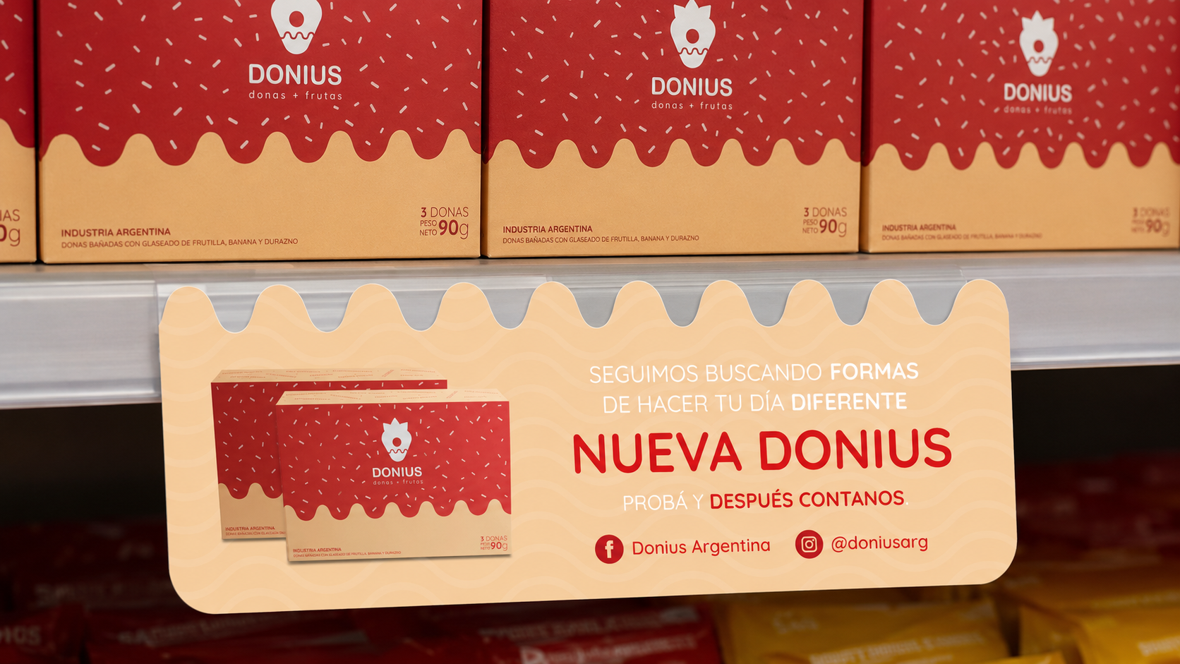
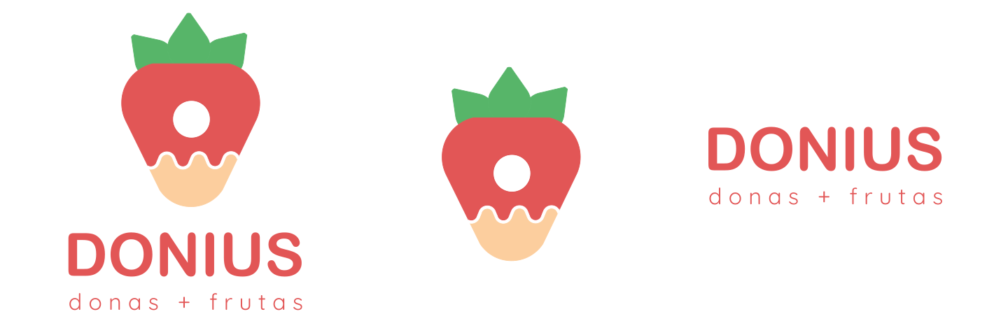
The first sub-brand is dedicated to fruit-inspired doughnuts. Its combined mark takes the shape of a strawberry and uses a more intense red-and-green palette. The shape hints at the flavor and makes each product recognizable before it is tasted.
DONIUS · doughnuts + animals
Concept
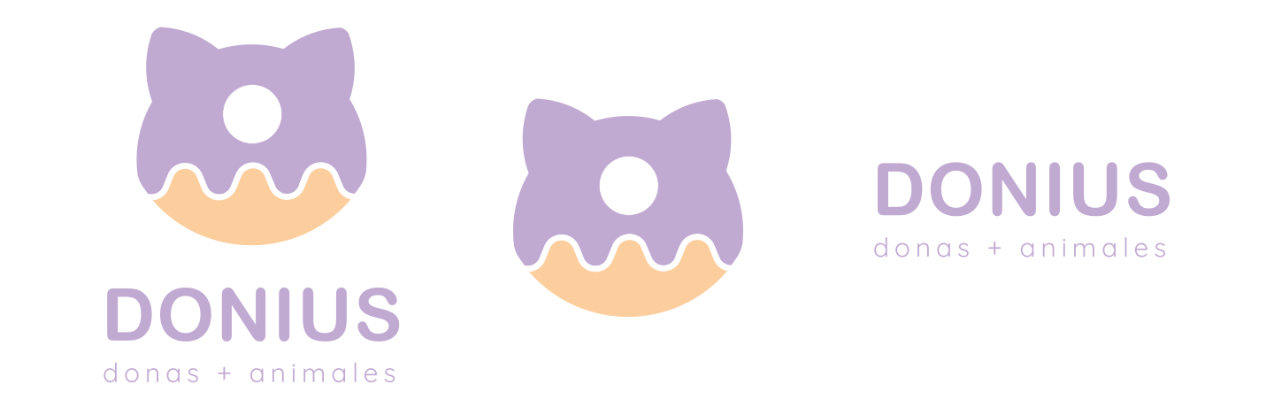
The second sub-brand features animal-shaped doughnuts. Its symbol uses the silhouette of a cat’s head and works mainly with lilac and purple. The system retains the familiarity of the parent brand while creating a sweeter, more expressive tone.
Full brand guidelines
System
for the brand
The guidelines bring together construction rules, minimum sizes, permitted uses, color palettes, monochrome versions, and applications over photography for the parent brand and each sub-brand.
01 / 32
01 / 32
The system becomes a product
Packaging
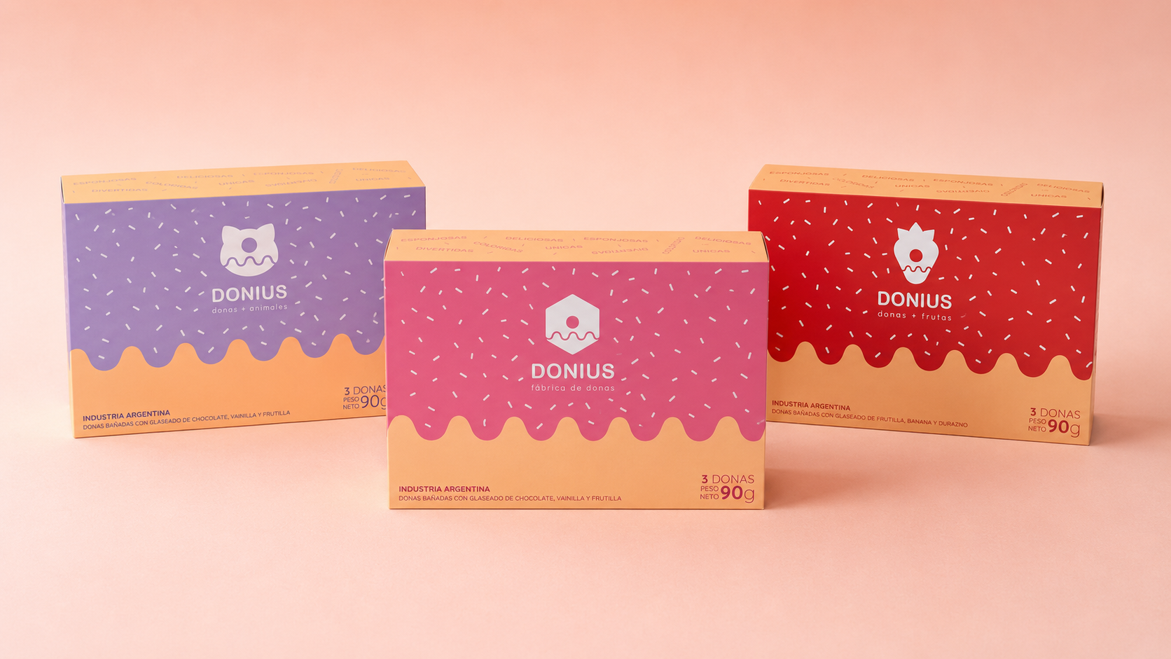
The identity extends to a family of boxes that distinguishes the three product lines through color and symbols while maintaining a shared structure. The pattern, icing, and illustrations turn the packaging into an immediate extension of the visual system.
The variations make it easy to identify the general, fruit, or animal offering. Inside, each box carries its corresponding palette and combined mark, reinforcing the experience from purchase to unboxing.
DONIUS in the spotlight
Promotional
communication
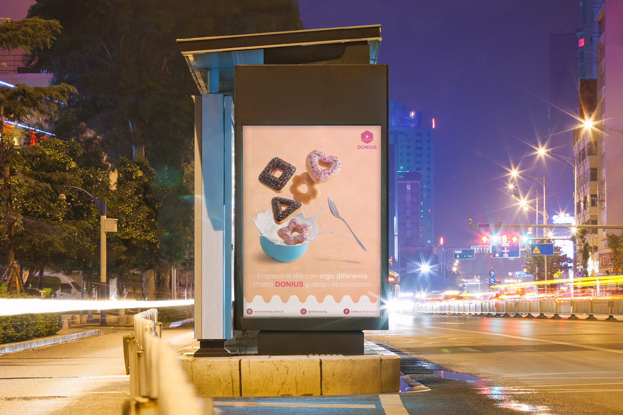
The identity of DONIUS was extended to a series of promotional pieces designed to strengthen the brand’s presence and support its product launch.
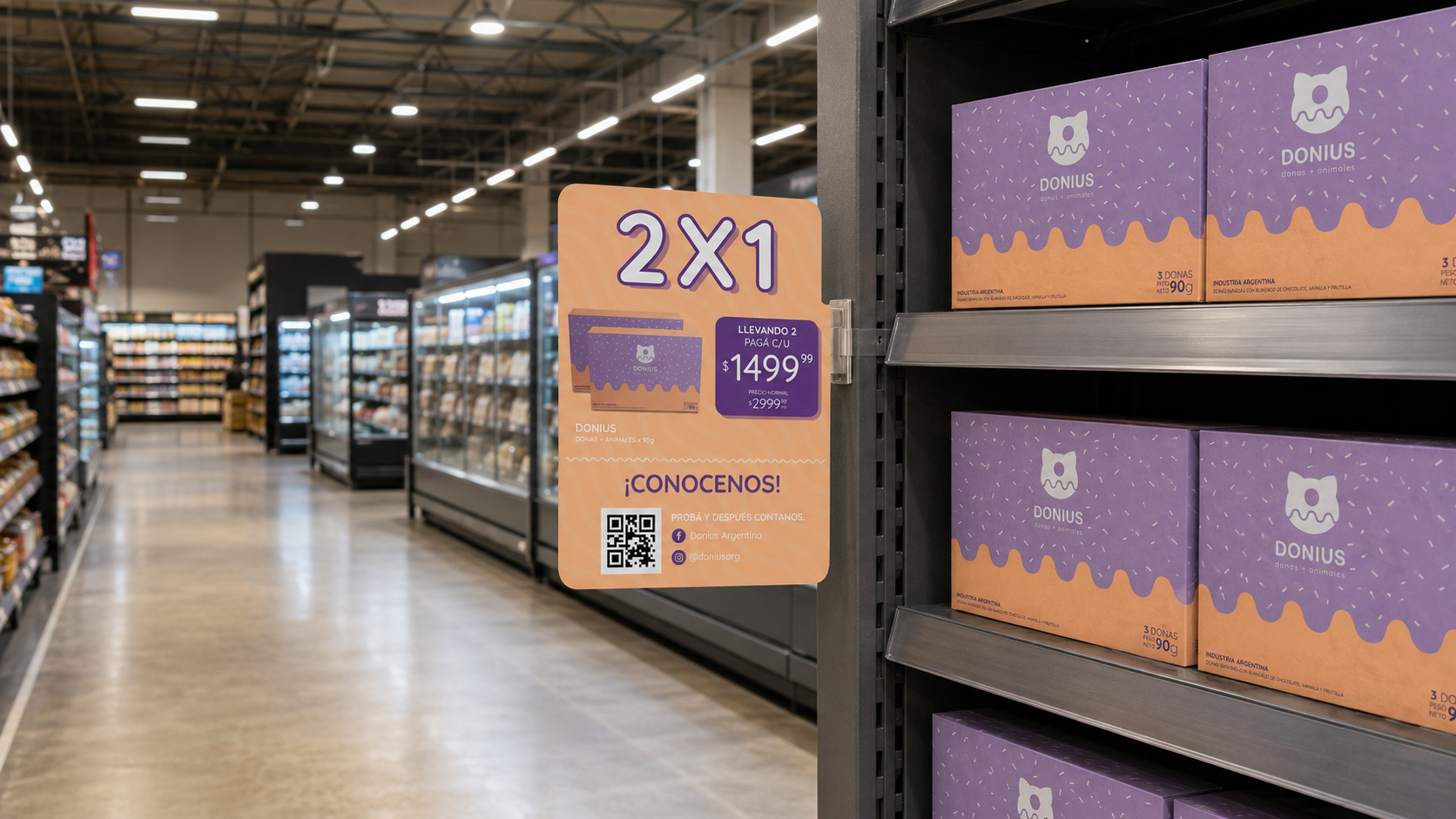
The poster combines photography, color, and graphic elements to create an eye-catching message and make the world of DONIUS. POP materials carry the same language into the retail space, highlighting products, promotions, and contact channels.