Designing the identity of tension
What was
the challenge?
ETREUM is an international horror film festival in Buenos Aires. The challenge was to develop an identity capable of representing the genre without relying solely on its most obvious codes.
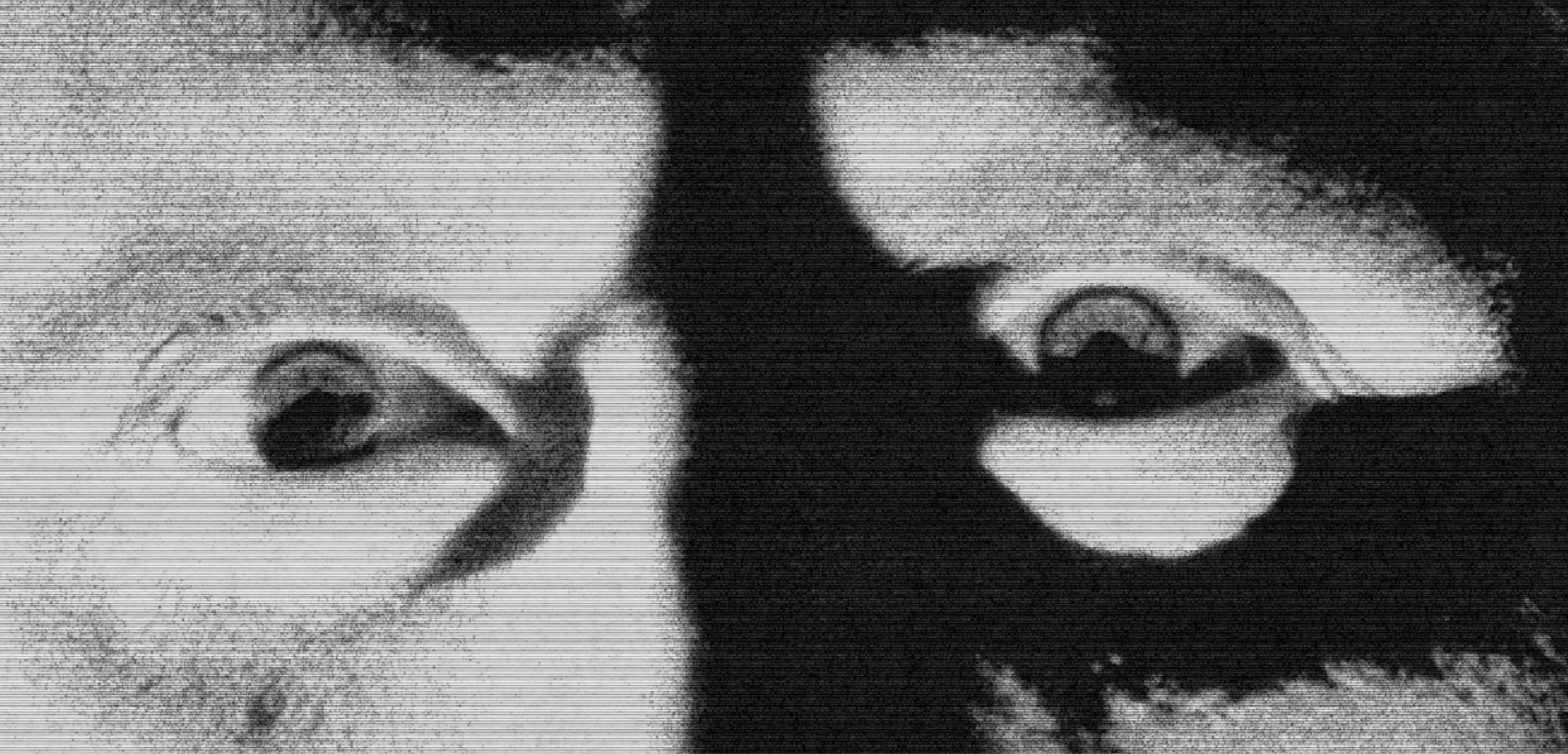
Rather than focusing on fear as the outcome, we concentrated on the moment before it: uncertainty, physical tension, and the feeling that something is about to happen.
Fear before fear
Main
concept
The concept begins with the anticipation before a scare: the instant when the body recognizes a threat before fully understanding it.
A racing pulse, tension, and a heightened state of alert were translated into an unstable graphic system built around contrast. The compositions aim to evoke the same discomfort that arises when something feels out of place.
The identity was built around three main devices: compositional tension, image manipulation, and imagery inspired by Argentine folk tales.
Explaining
each device
Compositional tension
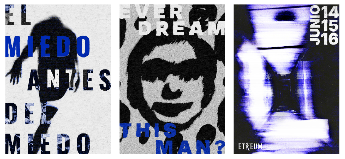
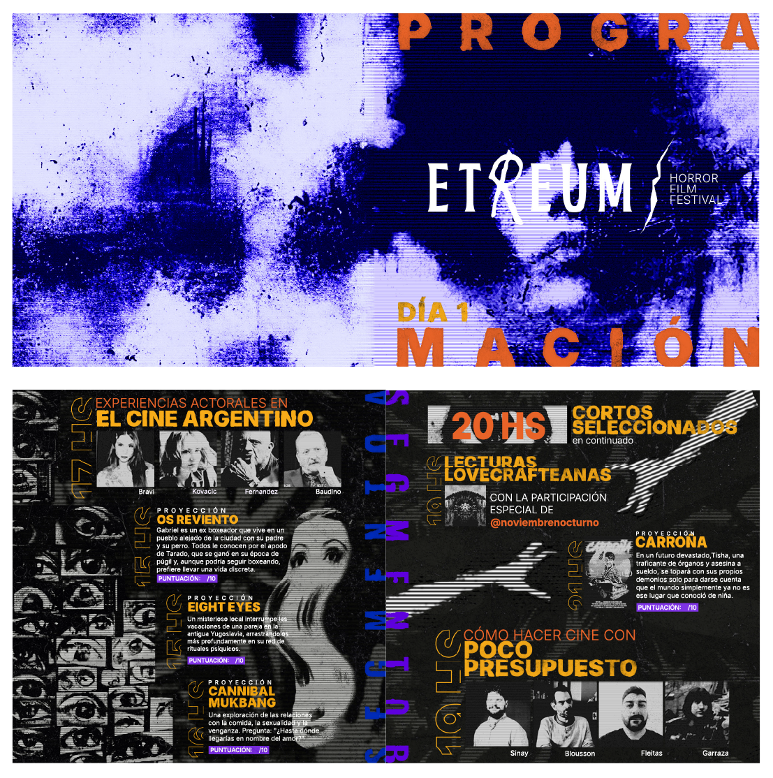
Elements move toward the edges, text pushes against the margins, and letter spacing expands until it disrupts reading. These choices create deliberately uncomfortable and unstable compositions.
Manipulated imagery
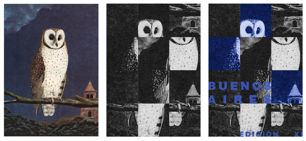
Photographs are fragmented through modular grids, patterns, blurs, and shifts in contrast. Each intervention transforms the original image and creates a sense of distortion and uncertainty.
Argentine folklore
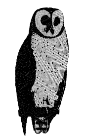
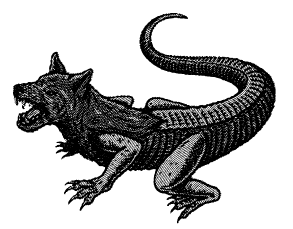
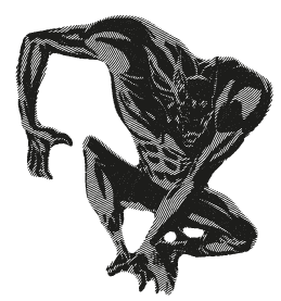
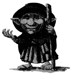
The system includes illustrations inspired by figures from the Argentine bestiary and folklore, including La Lechuza, El Lobizón, Pachamama, and El Yaguarón. Their treatment evokes antique engravings and connects horror with local stories.
An identity built through contrast
Logo
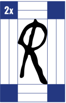
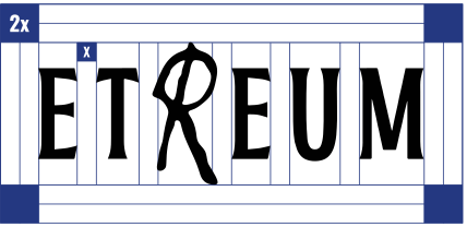
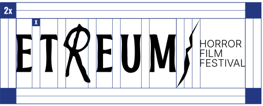
ETREUM’s identity introduces an anomaly within a stable typographic structure. The letter “R,” drawn with a gestural stroke and crossed by a diagonal, interrupts the logo’s rhythm and concentrates the brand’s tension.
Typography
Inter and Oswald create a flexible hierarchy across information, headlines, and promotional pieces. Combining the two families reinforces the contrast between clarity and tension.
Color
Black and white form the foundation of the system. Purple and blue serve as the main accents, while warm tones are reserved for highlighted information and selective contrasts.
#FFFFFF RGB 255 255 255 CMYK 0 0 0 0
#1C1C1C RGB 29 29 27 CMYK 76 67 64 80
#5E00DE RGB 94 0 221 CMYK 85 82 0 0
#002BB8 RGB 0 43 184 CMYK 97 81 0 0
#B0451F RGB 176 69 30 CMYK 22 80 95 15
#E86329 RGB 232 99 40 CMYK 2 72 89 0
#D9961A RGB 217 150 25 CMYK 14 43 96 3
#F7AB1A RGB 248 172 25 CMYK 2 37 92 0
Other applications
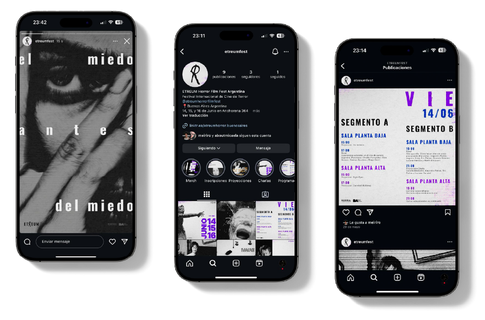
Social media
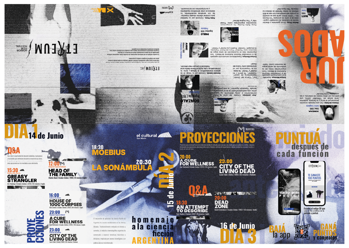
Complex foldout
The foldout uses folds, shifts in scale, and modular compositions to organize a large amount of information. When closed, it works as a compact publication; when unfolded, it reveals a larger-scale graphic composition.
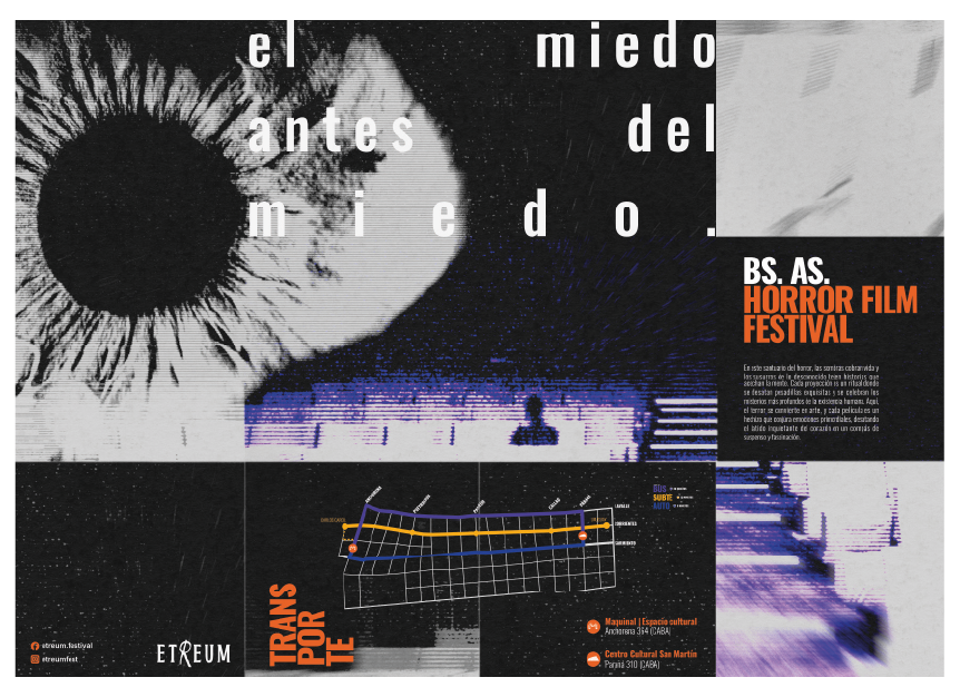
Diptych
The identity takes over the space
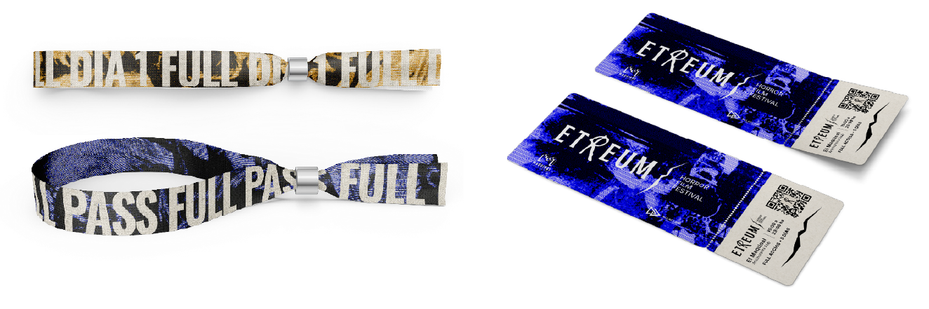
Tickets, wristbands
and an Instagrammable installation
The brand experience was extended to tickets, wristbands, and different installations throughout the festival.
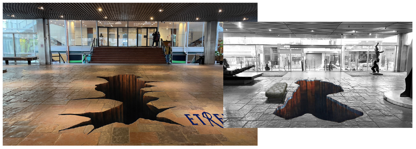
One of the applications was an anamorphic installation that uses perspective to produce a three-dimensional image. It represents fear of the unknown and aims to create a point of interaction between the identity and festival attendees.
Outdoor
campaign

Full brand guidelines

01–02 / 58
01–02 / 58
Project created in collaboration with Rodrigo Meiriño and Renso Dantagnan.
